The upholstered bookcases with nailhead trim had me at hello. I definitely need to own these someday. I love bookcases with closed storage below to hide stationery and unattractive or embarrassing self help books.
Some books were covered in colored paper and finished off with accessories.
The wall color is Polaris from Ralph Lauren Paint and it too changed color according to the light. During the day it looked blue and when I attended the opening night party, it looked more grey. You should always test paint and look at it at different times of day and in different light.
I also like that the bookshelves were placed off center. It means the television is closer to the sofa and it allows room for the sculpture in the corner. Thomas O'Brien didn't follow the usual furniture plan of two chairs directly across from the sofa but they could probably be moved anywhere someone wanted to sit.
Most of the fabric in the room is Thomas O'Brien for Lee Jofa and Kravet. The trim is from Samuel & Sons.
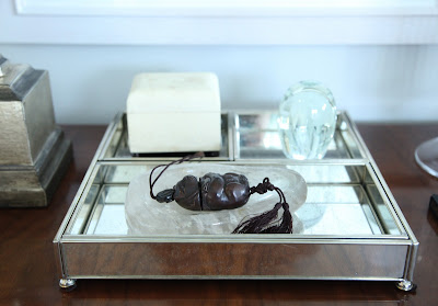
There were interesting accessories everywhere you looked in the room.
Some pieces also have an Asian influence.
The vintage rug from Safaviah has a flower motif is complemented by the round coffee table.
More objects and books.
I loved this little turtle on the living room coffee table.
Much of the large artwork is from Natural Curiosities.
Round table calls for a round bowl.
The dining area of the room has an expandable table from Hickory Chair.
The Tree of Life artwork is by Natural Curiosities.
I always think that pieces from another culture like this blue and white porcelain give you the sense that the owner travels and collects. Even if they just come from Pearl River.
This was my favorite kitchen. The Brazilian Ruby wall color from Ralph Lauren Paint warms up the clean lines of the cabinetry.
I love adding accessories and even lamps to kitchens and bathrooms. This little lamp is the perfect size for under the cabinets.
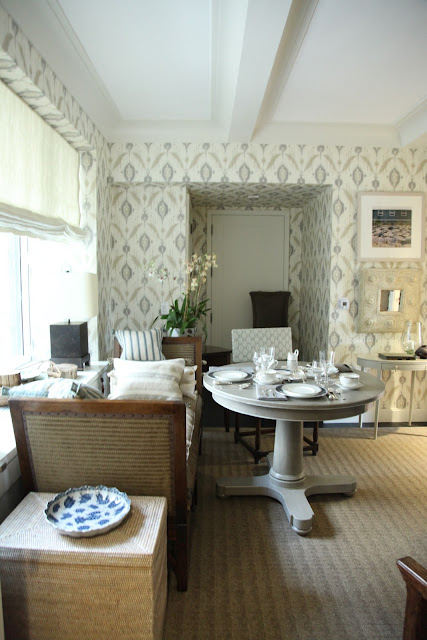
They are calling this room the library but it also serves as a breakfast room. The wallcovering is Island Ikat from Thibaut.
This photo is slightly blurry but I wanted you to see the great wall of bookshelves on the other side of the room.
The Marielle dinnerware is Thomas O'Brien for Reed & Barton as is the flatware.
Thomas O'Brien also created a soothing blue bedroom.
Much of the furniture in the master bedroom is Thomas O'Brien for Hickory Chair.
The headboard shape is especially lovely.
This is the famous desk that made it's way into the Sex and the City 2 movie.
Couldn't resist taking a photo of this cute little guy.
The wing chair fabric is Kalina from Kravet.
I like the juxtaposition of the photograph and floral fabric. It keeps the room from being too sweet.
A fat little Buddha sits atop the dresser.
More photography.
I absolutely love that the curtain fabric by Kravet creates a pattern when pulled back. Most of the time you lose the pattern. They were fabricated by Jonas who is a master so that accounts for their perfection.
It might be hard to tell but the green in the fabrics picks up on the green trees of Central Park right outside the window. This apartment had a really lovely view.
The master bathroom is just down the hallway.
It was created by S. Russell Groves and might actually my favorite room of all.
All of the fixtures are Kohler and that black and white floor is so chic.
This little Lucite table is from Plexi-Craft.
I love the black outlines around the room.
There is a great view from the bathroom. Too bad the neighbors in the next building would also be able to see you unless you used lots of bubbles!
Another look at the view.
The entrance had another beautiful carpet and lots of art.
This is the perfect sized accent table for New York apartments. Another large Hickory Chair dresser, below, makes a perfect entry table for hiding papers or perhaps hats and gloves for a walk in the park.
I hope you've enjoyed this tour of the three spaces in the Hearst Designer Visions Cinema Style Show House. As I mentioned, it's one of my favorite events and I can't wait to see what they come up with next year. If you missed attending in person, I heard that it might be open again on October 22nd through the Junior League.
Photos by Heather Clawson for Habitually Chic


No comments:
Post a Comment